Accenture Design System for Power BI
Accenture Design System for Power BI
Accenture uses 360° Value Navigator tool to measure and track the overall value and impact they created across various businesses. This case study involves redefine and recreating the design system used to reports for the platforms.
Accenture uses 360° Value Navigator tool to measure and track the overall value and impact they created across various businesses. This case study involves redefine and recreating the design system used to reports for the platforms.
My Role
Create the design system for charts and tables.
Duration
1 month

Accenture Design System
Power BI
Accenture Design System
Power BI
What problem are we solving
What problem are we solving
The reports included multiple complex data visualizations like bar charts, trend lines, waterfall charts, pie charts, gauges, decomposition trees, and tables, but the existing design system lacked consistency and scalability across reports.
The reports included multiple complex data visualizations like bar charts, trend lines, waterfall charts, pie charts, gauges, decomposition trees, and tables, but the existing design system lacked consistency and scalability across reports.
No rules, no system, no single source just scattered components, inconsistent charts, and a library too bloated to be useful.
No rules, no system, no single source just scattered components, inconsistent charts, and a library too bloated to be useful.
Charts and tables had no unified standard, making reports hard to read and compare
Designers wasted time searching across scattered files and outdated libraries
Too many options and variants created decision fatigue and slowed production
Unused variants bloated the library and increased component load times
No shared source of truth caused mismatches between designs and final reports
Charts and tables had no unified standard, making reports hard to read and compare
Designers wasted time searching across scattered files and outdated libraries
Too many options and variants created decision fatigue and slowed production
Unused variants bloated the library and increased component load times
No shared source of truth caused mismatches between designs and final reports
Charts and tables had no unified standard, making reports hard to read and compare
Designers wasted time searching across scattered files and outdated libraries
Too many options and variants created decision fatigue and slowed production
Unused variants bloated the library and increased component load times
No shared source of truth caused mismatches between designs and final reports

What is our Aim
What is our Aim
Build a scalable design system for Accenture’s 360° Value Navigator.
Create lightweight, reusable chart and table components with fewer variants.
Improve consistency across reports and library.
Simplify component structure and reduce design duplication.
Speed up the design-to-development handoff process.
Build a scalable design system for Accenture’s 360° Value Navigator.
Create lightweight, reusable chart and table components with fewer variants.
Improve consistency across reports and library.
Simplify component structure and reduce design duplication.
Speed up the design-to-development handoff process.
Lets get into some of the details
Lets get into some of the details
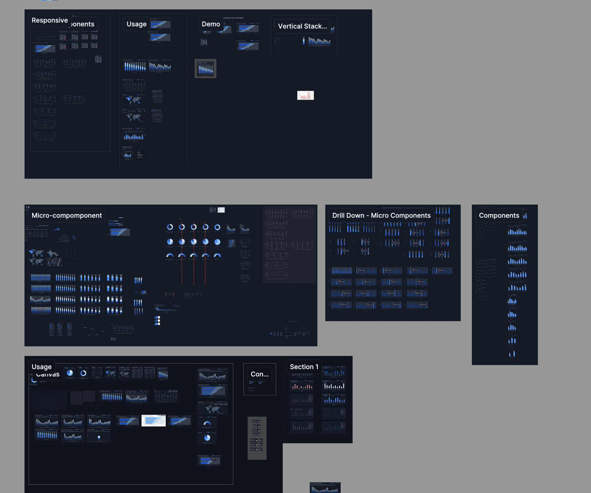
A key part of the process was understanding the purpose of different chart types, when to use them, and how they impact data readability and decision-making. Our Team Lead, Itziar, who specializes in Power BI, guided us through the fundamentals of data visualization and shared valuable study material and best practices for charts and graphs.
A key part of the process was understanding the purpose of different chart types, when to use them, and how they impact data readability and decision-making. Our Team Lead, Itziar, who specializes in Power BI, guided us through the fundamentals of data visualization and shared valuable study material and best practices for charts and graphs.

The older component structure contained several unnecessary boolean properties, which were removed to make the system lighter and more organized. Bar lengths were instead managed through variants, creating a cleaner and more scalable component architecture.
The older component structure contained several unnecessary boolean properties, which were removed to make the system lighter and more organized. Bar lengths were instead managed through variants, creating a cleaner and more scalable component architecture.

Restructured all components to create a more consistent, lightweight, and scalable design system. Introduced flexible customization options to make adjustments easier and more efficient for users.
Restructured all components to create a more consistent, lightweight, and scalable design system. Introduced flexible customization options to make adjustments easier and more efficient for users.

Color played a critical role in improving data readability, especially in dense charts and tables where closely packed lines and bars could become difficult to interpret. I collaborated closely with the color team to define a clear and accessible color system for the overall data visualization experience.
Color played a critical role in improving data readability, especially in dense charts and tables where closely packed lines and bars could become difficult to interpret. I collaborated closely with the color team to define a clear and accessible color system for the overall data visualization experience.

Introduced slot-based sizing for chart components, allowing them to adapt seamlessly across three main card sizes without manual resizing, making chart usage faster and more efficient for users.
Introduced slot-based sizing for chart components, allowing them to adapt seamlessly across three main card sizes without manual resizing, making chart usage faster and more efficient for users.

The grid system played a key role in improving chart readability. After multiple discussions and testing, we standardized vertical grid lines for horizontal bar charts and horizontal grid lines for vertical bar charts, helping users read and interpret data more easily.
The grid system played a key role in improving chart readability. After multiple discussions and testing, we standardized vertical grid lines for horizontal bar charts and horizontal grid lines for vertical bar charts, helping users read and interpret data more easily.


Reorganized the Figma design system file: created clear sections (Tokens / Atoms / Molecules / Organisms) with naming conventions, usage guidelines, and notes.
Reorganized the Figma design system file: created clear sections (Tokens / Atoms / Molecules / Organisms) with naming conventions, usage guidelines, and notes.

Created detailed documentation to streamline developer handoff, covering component structure, usage guidelines, do’s and don’ts, anatomy, properties, dimensions, modes, variants, and nested instances for consistent implementation.
Created detailed documentation to streamline developer handoff, covering component structure, usage guidelines, do’s and don’ts, anatomy, properties, dimensions, modes, variants, and nested instances for consistent implementation.
What we built
What we built
After several rounds of discussion over color, components structure documentation etc, we finalised the chart component for Power BI.
After several rounds of discussion over color, components structure documentation etc, we finalised the chart component for Power BI.
Designed comprehensive documentation defining guidelines for different chart types, and optimized the component architecture to deliver a seamless, intuitive user experience.
Designed comprehensive documentation defining guidelines for different chart types, and optimized the component architecture to deliver a seamless, intuitive user experience.
Eliminating redundant development by enabling teams to easily find and reuse existing assets, driving a 70% adoption rate and a 3x increase in component usage.
Redesigned the primary component to reduce technical debt and clutter, successfully accelerating report performance by 80%.
Streamlined report creation by introducing a slot feature that ensured design consistency while allowing fast, effortless customization.
Scaled a unified design language for the Accenture 360 Value Navigator, eliminating visual fragmentation across multiple product teams and workstreams.
Accelerated cross-product delivery by providing clear design and development documentation, ensuring unified reporting standards across the 360 VN platform.
Eliminating redundant development by enabling teams to easily find and reuse existing assets, driving a 70% adoption rate and a 3x increase in component usage.
Redesigned the primary component to reduce technical debt and clutter, successfully accelerating report performance by 80%.
Streamlined report creation by introducing a slot feature that ensured design consistency while allowing fast, effortless customization.
Scaled a unified design language for the Accenture 360 Value Navigator, eliminating visual fragmentation across multiple product teams and workstreams.
Accelerated cross-product delivery by providing clear design and development documentation, ensuring unified reporting standards across the 360 VN platform.

Contact
Let's start creating together
ujjwal.design23@gmail.com
Copied
2026 Ujjwal Kumar Singh I Portfolio I All rights reserved
Contact
Let's start creating together
ujjwal.design23@gmail.com
Copied
2026 Ujjwal Kumar Singh I Portfolio I All rights reserved
Contact
Let's start creating together
ujjwal.design23@gmail.com
Copied
2026 Ujjwal Kumar Singh I Portfolio I All rights reserved