Multichoice: DStv
Multichoice: DStv
Multichoice: DStv
DStv, launched in 1995 by MultiChoice, is a major video entertainment provider in sub-Saharan Africa. This project focuses on helping the client team solve various platform issues across all devices.
DStv, launched in 1995 by MultiChoice, is a major video entertainment provider in sub-Saharan Africa. This project focuses on helping the client team solve various platform issues across all devices.
DStv, launched in 1995 by MultiChoice, is a major video entertainment provider in sub-Saharan Africa. This project focuses on helping the client team solve various platform issues across all devices.
Ticket 5.0 - UX_Acquisitions > Simple sign-in
Ticket 5.0 - UX_Acquisitions > Simple sign-in
Ticket 5.1 - UX_Acquisitions > Simple sign-up
Ticket 5.1 - UX_Acquisitions > Simple sign-up
Ticket 5.2 - UX_Acquisitions > Create new password
Ticket 5.2 - UX_Acquisitions > Create new password
This was a key project I worked on at MultiChoice, focused on improving the DStv onboarding journey. After a workshop to identify pain points, I redesigned the sign-in, signup, and password flows to make the user experience smoother and more efficient.
This was a key project I worked on at MultiChoice, focused on improving the DStv onboarding journey. After a workshop to identify pain points, I redesigned the sign-in, signup, and password flows to make the user experience smoother and more efficient.
Here's an example of a Jira ticket from my work for your reference:
Here's an example of a Jira ticket from my work for your reference:
Metrics
Drop off
34%
Note - You can find the Impact Metrics (result) at the end of case study
Metrics
Drop off
Drop off
34%
34%
Note - You can find the Impact Metrics (result) at the end of case study
Note - You can find the Impact Metrics (result) at the end of case study
Empathy Mapping
Empathy Mapping
Empathy Mapping
We used empathy mapping and marketing feedback to uncover user pain points in DStv’s onboarding, leading to a more user-friendly design that boosts satisfaction and retention.
We used empathy mapping and marketing feedback to uncover user pain points in DStv’s onboarding, leading to a more user-friendly design that boosts satisfaction and retention.
We used empathy mapping and marketing feedback to uncover user pain points in DStv’s onboarding, leading to a more user-friendly design that boosts satisfaction and retention.

Insights
Insights
Based on empathy mapping, we prioritized improving sign-in, signup, and password flows to create a smoother, more intuitive onboarding experience.
Based on empathy mapping, we prioritized improving sign-in, signup, and password flows to create a smoother, more intuitive onboarding experience.
Based on empathy mapping, we prioritized improving sign-in, signup, and password flows to create a smoother, more intuitive onboarding experience.
Simple sign-in
Simple sign-in
Problem statement
Problem statement
Country flag as input can confuse users between mobile and landline numbers.
Many users are unaware they can use their email to sign in.
Country flag as input can confuse users between mobile and landline numbers.
Many users are unaware they can use their email to sign in.

Approach
1st Stage
Despite clear pain points in the problem statement, I conducted benchmarking to see how other OTT platforms handle onboarding.
This research revealed best practices and insights that helped shape our UX design improvements.
2nd Stage
Map out each step of the user journey to identify gaps and improvement areas.
Analyze the flow to understand the overall user experience.
Uncover key pain points affecting the journey.
Use insights as a foundation to create a smoother, more efficient experience.
3rd Stage
Create high-fidelity screens to present design concepts clearly.
Use these screens to gather meaningful feedback from the team.
Refine the design based on collected insights.
Ensure the final design meets project goals and user needs.
Approach
1st Stage
Despite clear pain points in the problem statement, I conducted benchmarking to see how other OTT platforms handle onboarding.
This research revealed best practices and insights that helped shape our UX design improvements.
2nd Stage
Map out each step of the user journey to identify gaps and improvement areas.
Analyze the flow to understand the overall user experience.
Uncover key pain points affecting the journey.
Use insights as a foundation to create a smoother, more efficient experience.
3rd Stage
Create high-fidelity screens to present design concepts clearly.
Use these screens to gather meaningful feedback from the team.
Refine the design based on collected insights.
Ensure the final design meets project goals and user needs.
BenchMarking
BenchMarking





Insights
Insights
Insights
Benchmarking showed most OTT platforms use email/password sign-in, some use phone number with OTP, and only one offers flexible sign-in via either email or phone. I took inspiration from that.
Benchmarking showed most OTT platforms use email/password sign-in, some use phone number with OTP, and only one offers flexible sign-in via either email or phone. I took inspiration from that.
Benchmarking showed most OTT platforms use email/password sign-in, some use phone number with OTP, and only one offers flexible sign-in via either email or phone. I took inspiration from that.
Identified Design Flaws
Country Flag Bias: Pushes users toward mobile number login, limiting email options.
Missing "Remember Me": Users must log in every time, reducing convenience.
Inconsistent CTAs: Confusing and unclear actions for resetting credentials.
Poor Error Handling: Lack of clear feedback when login fails, causing user frustration.
Country Flag Bias: Pushes users toward mobile number login, limiting email options.
Missing "Remember Me": Users must log in every time, reducing convenience.
Inconsistent CTAs: Confusing and unclear actions for resetting credentials.
Poor Error Handling: Lack of clear feedback when login fails, causing user frustration.
Identified Design Flaws

User Journey
User Journey


User journey
User journey

High Fidelity
High Fidelity


After finalizing the user journey, I designed high-fidelity screens to ensure a seamless and intuitive sign-in experience. The sign-in page features a single input field that smartly detects whether users are entering an email or phone number. If the input begins with a digit, a country code appears subtly, disappearing if the user switches to typing letters—maintaining a smooth typing flow.
Upon clicking "Continue," users are either guided to the password flow or shown an error if credentials are invalid. The password screen maintains simplicity with a single input and an option to recall a remembered password. Successful sign-ins redirect users to the DSTv homepage, while incorrect passwords trigger clear error messages.
Throughout the flow, I accounted for various edge cases and integrated informative feedback to ensure a user-friendly, error-tolerant experience that reduces friction and improves overall usability.
After finalizing the user journey, I designed high-fidelity screens to ensure a seamless and intuitive sign-in experience. The sign-in page features a single input field that smartly detects whether users are entering an email or phone number. If the input begins with a digit, a country code appears subtly, disappearing if the user switches to typing letters—maintaining a smooth typing flow.
Upon clicking "Continue," users are either guided to the password flow or shown an error if credentials are invalid. The password screen maintains simplicity with a single input and an option to recall a remembered password. Successful sign-ins redirect users to the DSTv homepage, while incorrect passwords trigger clear error messages.
Throughout the flow, I accounted for various edge cases and integrated informative feedback to ensure a user-friendly, error-tolerant experience that reduces friction and improves overall usability.
After finalizing the user journey, I designed high-fidelity screens to ensure a seamless and intuitive sign-in experience. The sign-in page features a single input field that smartly detects whether users are entering an email or phone number. If the input begins with a digit, a country code appears subtly, disappearing if the user switches to typing letters—maintaining a smooth typing flow.
Upon clicking "Continue," users are either guided to the password flow or shown an error if credentials are invalid. The password screen maintains simplicity with a single input and an option to recall a remembered password. Successful sign-ins redirect users to the DSTv homepage, while incorrect passwords trigger clear error messages.
Throughout the flow, I accounted for various edge cases and integrated informative feedback to ensure a user-friendly, error-tolerant experience that reduces friction and improves overall usability.
Simple sign-up
Simplify the sign-up and sign-in process for customers.
Reduce the level of effort (LOE) required.
Lower cognitive load by clarifying if users have already signed up.


Simple sign-up
Simplify the sign-up and sign-in process for customers.
Reduce the level of effort (LOE) required.
Lower cognitive load by clarifying if users have already signed up.
Approach:
Approach:
The approach was almost same as before Benchmarking > analysis > User journey > High fidelity.
The approach was almost same as before Benchmarking > analysis > User journey > High fidelity.

Insights
Insights
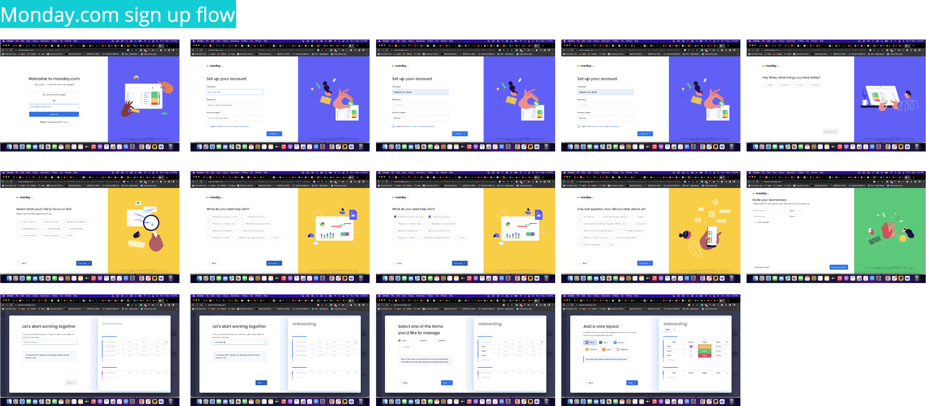
Benchmarking Monday and Netflix sign-in flows showed Netflix stands out by letting users sign in with either email or phone number, offering more flexibility and convenience—aligning with our goal for a user-friendly experience.
Benchmarking Monday and Netflix sign-in flows showed Netflix stands out by letting users sign in with either email or phone number, offering more flexibility and convenience—aligning with our goal for a user-friendly experience.
Benchmarking Monday and Netflix sign-in flows showed Netflix stands out by letting users sign in with either email or phone number, offering more flexibility and convenience—aligning with our goal for a user-friendly experience.
Problem with present design
Problem with present design



When users reach the DSTv homepage during onboarding, unclear sign-in and sign-up options confuse new users. They may try to sign in without an account and get errors, causing frustration. Lack of clear instructions about credential requirements adds to the confusion.
When users reach the DSTv homepage during onboarding, unclear sign-in and sign-up options confuse new users. They may try to sign in without an account and get errors, causing frustration. Lack of clear instructions about credential requirements adds to the confusion.

High Fidelity
High Fidelity

Upon reaching the DSTv homepage for onboarding, users are presented with a single input field, providing clarity and a straightforward path forward. They are informed of the purpose behind entering their credentials. Users can choose to sign in with either their email or phone number, with the input field adjusting accordingly. For example, if a user starts with a number, the country code appears, but if they start with an alphabet, no change occurs.
Correct credentials lead new users to the sign-up screen and existing users to the sign-in screen. The sign-up screen then asks for the missing information (either phone number or email) based on the previous input. The password creation screen keeps it simple with one input field and a visual strength indicator.
After completing all required steps, users are successfully onboarded and redirected to the DSTv platform, ensuring a seamless, intuitive, and efficient onboarding experience for both new and existing users.
Upon reaching the DSTv homepage for onboarding, users are presented with a single input field, providing clarity and a straightforward path forward. They are informed of the purpose behind entering their credentials. Users can choose to sign in with either their email or phone number, with the input field adjusting accordingly. For example, if a user starts with a number, the country code appears, but if they start with an alphabet, no change occurs.
Correct credentials lead new users to the sign-up screen and existing users to the sign-in screen. The sign-up screen then asks for the missing information (either phone number or email) based on the previous input. The password creation screen keeps it simple with one input field and a visual strength indicator.
After completing all required steps, users are successfully onboarded and redirected to the DSTv platform, ensuring a seamless, intuitive, and efficient onboarding experience for both new and existing users.
Upon reaching the DSTv homepage for onboarding, users are presented with a single input field, providing clarity and a straightforward path forward. They are informed of the purpose behind entering their credentials. Users can choose to sign in with either their email or phone number, with the input field adjusting accordingly. For example, if a user starts with a number, the country code appears, but if they start with an alphabet, no change occurs.
Correct credentials lead new users to the sign-up screen and existing users to the sign-in screen. The sign-up screen then asks for the missing information (either phone number or email) based on the previous input. The password creation screen keeps it simple with one input field and a visual strength indicator.
After completing all required steps, users are successfully onboarded and redirected to the DSTv platform, ensuring a seamless, intuitive, and efficient onboarding experience for both new and existing users.
Ticket 5.2- UX_Acquisitions > Create new password
Clearly indicate which account the password is being reset for.
Use "Re-enter Password" instead of "Confirm Password" for better clarity.
Benchmark similar platforms to explore ways to improve the screen's UX.
Create new password
Clearly indicate which account the password is being reset for.
Use "Re-enter Password" instead of "Confirm Password" for better clarity.
Benchmark similar platforms to explore ways to improve the screen's UX.


Insights
Insights
Benchmarking OTT platforms revealed useful practices like a visual password strength bar and a clear step-by-step reset process. These insights will help improve the user experience and security of our password reset flow.
Benchmarking OTT platforms revealed useful practices like a visual password strength bar and a clear step-by-step reset process. These insights will help improve the user experience and security of our password reset flow.
Benchmarking OTT platforms revealed useful practices like a visual password strength bar and a clear step-by-step reset process. These insights will help improve the user experience and security of our password reset flow.
Flaws in this design
Flaws in this design
No clear minimum password requirements.
Lacks a password strength indicator.
“Confirm Password” adds unnecessary complexity.
Missing “Log out all devices” option, posing a security risk.
Password feedback could be more engaging to promote stronger passwords.
No clear minimum password requirements.
Lacks a password strength indicator.
“Confirm Password” adds unnecessary complexity.
Missing “Log out all devices” option, posing a security risk.
Password feedback could be more engaging to promote stronger passwords.
User journey
User journey

High Fidelity
High Fidelity

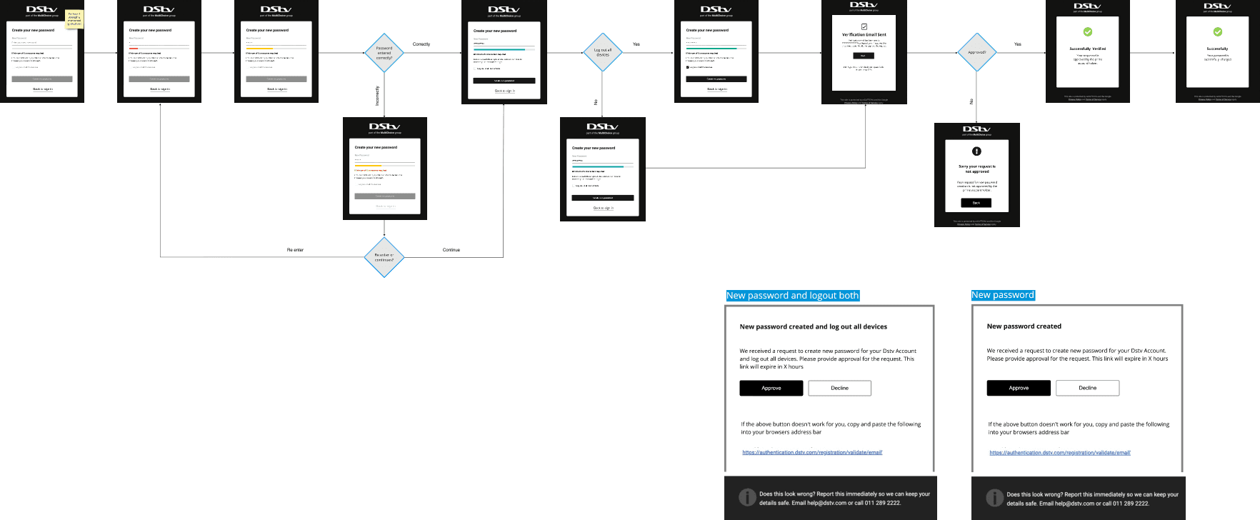
The password setup process has been significantly improved for better security and user-friendliness. Clear password strength requirements are now specified to ensure users create secure passwords. A helpful strength guide offers suggestions for creating stronger passwords.
To simplify the process, the redundant "Confirm Password" step has been removed, making the setup smoother. Users can now opt to "Log out all devices," enhancing account security, with a confirmation email verifying the action.
These enhancements empower users to create robust passwords and provide greater control over their accounts, contributing to a safer, more user-friendly experience.
The password setup process has been significantly improved for better security and user-friendliness. Clear password strength requirements are now specified to ensure users create secure passwords. A helpful strength guide offers suggestions for creating stronger passwords.
To simplify the process, the redundant "Confirm Password" step has been removed, making the setup smoother. Users can now opt to "Log out all devices," enhancing account security, with a confirmation email verifying the action.
These enhancements empower users to create robust passwords and provide greater control over their accounts, contributing to a safer, more user-friendly experience.
Metrics
Drop off
22%
Succesfully achieved 12% reduction drop off.
Metrics
Drop off
22%
Succesfully achieved 12% reduction drop off.
Metrics
Drop off
22%
Succesfully achieved 12% reduction drop off.
Ticket 2.0- UX_Acquisitions > Simple sign-in
Description
Country flag as an input prompt for providing a number can lead to confusion between mobile and landline numbers.
Customers might not be aware that they can use their email address for Sign-in.
Proposed solution: Implement a dropdown menu for users to choose their preferred sign-in method.
Utilize an intuitive component to automatically detect the country code if a mobile number is entered, displaying it only in such cases.

Flaws in the design:
1. Country Flag Bias: The country flag prompt encourages users to enter a mobile number, potentially neglecting the option to use their email for sign-in. This bias limits the user's choice and may not cater to those who prefer email-based logins.
2. Lack of "Remember Me" Option: The absence of a "Remember Me" checkbox denies users the convenience of staying signed in, forcing them to log in repeatedly, which can be frustrating.
3. Mixed CTAs: The design features mixed calls-to-action for resetting the email ID, phone number (if applicable), and password. This inconsistency confuses users and makes the process less intuitive.
4. Inadequate Error Handling: After clicking on the sign-in button, users are not informed of incorrect credentials, leaving them unaware of what went wrong. This lack of feedback can lead to confusion and frustration as users are unable to identify the specific issue with their credentials.

Enter Password
Contact
Let's start creating together
ujjwal.design23@gmail.com
Copied
2026 Ujjwal Kumar Singh I Portfolio I All rights reserved
Contact
Let's start creating together
ujjwal.design23@gmail.com
Copied
2026 Ujjwal Kumar Singh I Portfolio I All rights reserved
Contact
Let's start creating together
ujjwal.design23@gmail.com
Copied
2026 Ujjwal Kumar Singh I Portfolio I All rights reserved
Contact
Let's start creating together
ujjwal.design23@gmail.com
Copied
2026 Ujjwal Kumar Singh I Portfolio I All rights reserved